The starting point:
At Tristyle the slogan says it all! In just a few years, the company has developed from it’s humble beginning into one of the leading sports science institutes in Vienna.
At Tristyle the slogan says it all! In just a few years, the company has developed from it’s humble beginning into one of the leading sports science institutes in Vienna.
gographics thought ahead and created a growth-friendly corporate design that is well prepared for a wide range of requirements:
The logo contains an integrated icon that works separately as a short form. The company color 100% cyan ensures that there are no problems with color deviations in a variety of applications. The company typeface with strong characteristics and recognizability helps establish a connection to the company, for example with sub-brands such as the Tristyle Academy.
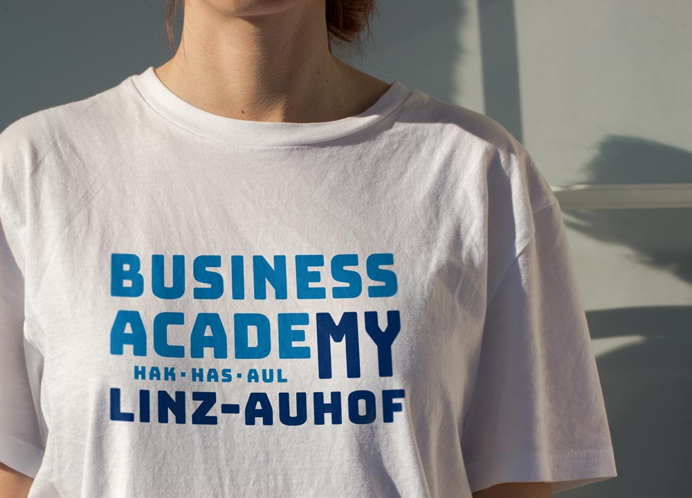
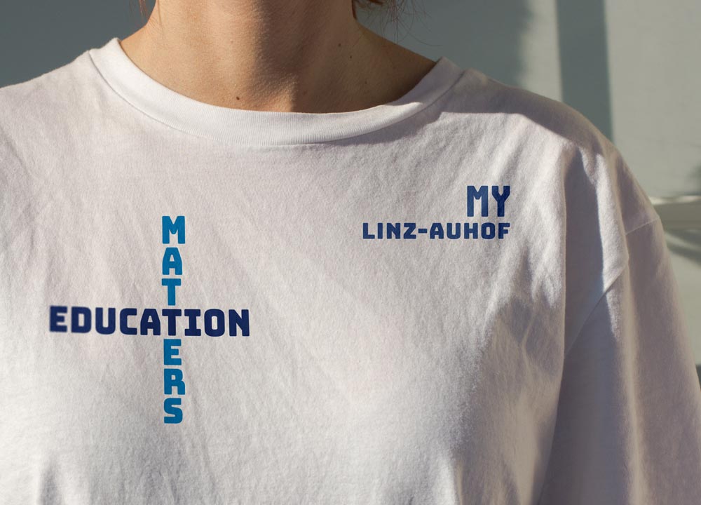
In addition to the Business Academy Linz-Auhof, there is a second school in Linz with a very similar range of courses. The new corporate design of the Business Academy Linz-Auhof should therefore stand out and bind students to the location.
When looking for a positioning, gographics found what it was looking for in the name itself and put the focus on “My Linz-Auhof”. This element is also used separately from the logo in the branding. The “Bungee” font offers the speciality that words can also be set vertically. The combination of horizontal and vertical terms is another corporate design element, which at the same time invites all users to experiment with their own creativity.
Christian Maria Albrecht, founder and owner of ambiente Innenarchitektur, has been leading projects in the commercial and interior design sectors for more than two decades. His distinctive design approach is reflected in bespoke spatial concepts that seamlessly unite functionality and aesthetics, always placing people at the heart of the design.
The logo and corporate design emphasize the individuality and sensitivity of the owner. gographics chose a handwritten font with varying stroke widths, which was post-processed. The “a” with which both the company name and the surname begin was used instead of the i-dot and thus has a special place.
Frank PTI is a company that is specialized on test measuring devices and offers a very wide range of devices and services. In the course of redesigning the catalogues, the first step was to create a clear structure.
A solid basis was created by gographics with icons for product groups and materials as well as a color coding system. Based on this, catalogues, product sheets, trade fair equipment, etc. were created. By consistently applying the classification scheme, the devices and services can be assigned at first glance and mis more userfriendly for employees and customers.
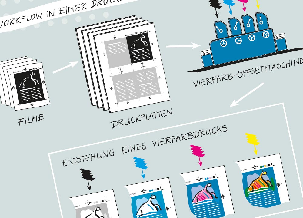
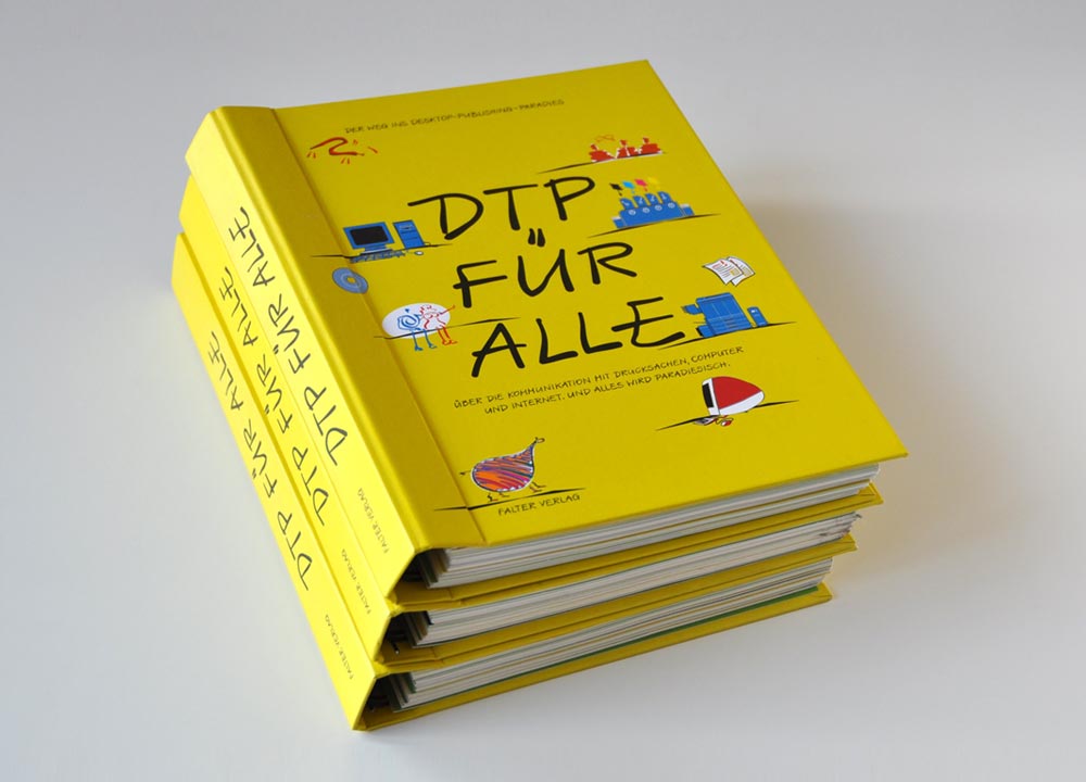
Every user of printers, scanners, etc. should have at least basic knowledge of file formats, image resolutions, color systems, etc. However, since this is usually not the case, Minolta published a technical book with the aim of making the rules of desktop publishing accessible to a broad user audience. Many dry terms and connections had to be explained.
Text and design use a narrative, playful style. The drawn illustrations by gographics almost obscure the fact that it is a technical book. In this way, readers lose their shyness about technical terms and technical content and are seduced, so to speak, into getting involved with complicated content.
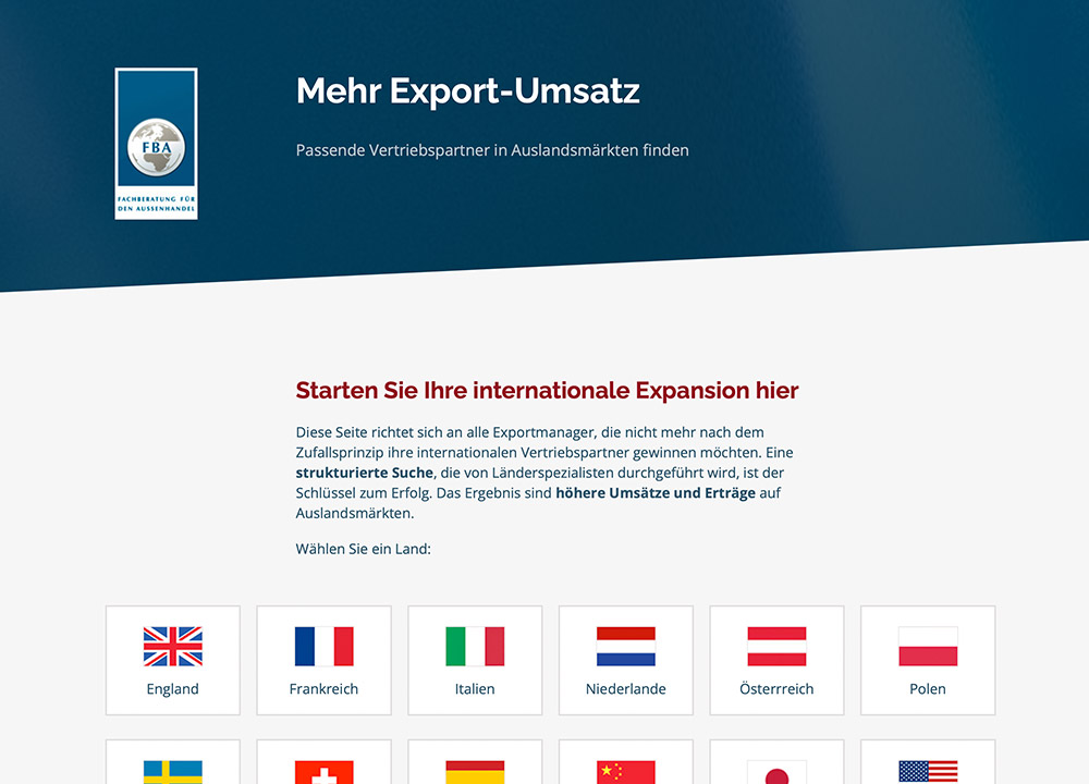
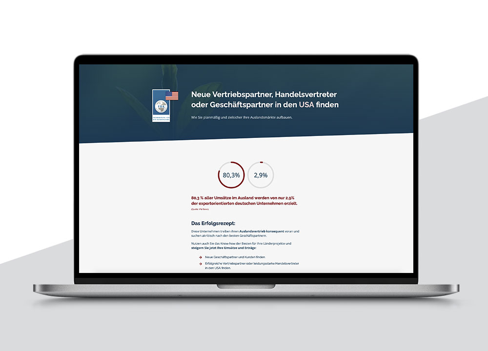
Content and keywords were carefully defined, the Adwords campaigns worked well, but users left the website too quickly and without getting in touch via contact form.
gographics optimized the website with a focus on making the pages pleasant and easy to consume for users. Design basics were applied: typography, spacing, contrasts and the sequence of content were revised. The result is a significantly better conversion rate of the website.